Posts

Showing posts with the label design

Pantone Colour of the Year for 2020

Image
Now, this is a colour I can get behind - Classic Blue. This shade of blue is great when "any shade of blue will do", which happens more often than you might think. Did you know blue is overwhelmingly the world's favourite colour? "We associate blue largely with the sky and water (as well as more mundane, but neutral-to-positive, items such as ballpoint pens and blue jeans), raising the average preference for blue higher than the remainder of the rainbow." -  Why Blue Is the World’s Favorite Color PANTONE 19-4052 TCX Classic Blue  colour values: RGB 15 76 129 HEX/HTML 0F4C81 CMYK 100 76 25 0 Will you be using more blue in your marketing in 2020? Click to Tweet this Article

Pantone Colour of the Year for 2019

Image
When I received Pantone's email announcement of their Colour of the Year for 2019, I didn't rush to blog about it as I usually would. Mostly I thought, "Huh?" And ever since, I've been wondering if I'll have the opportunity to use it in any of the digital marketing I do. Don't get me wrong, I love  Pantone 16-1546 Living Coral . But it feels a bit feminine for my purposes - which are marketing-related, of course. I decided to have a look at possible colour schemes using Living Coral... I'm kind of liking that triad combo! What do you think? Will you be using Living Coral in your branding this year? Click to Tweet this Article

No Bricks Between Friends

Image
Sometimes it's hard to give honest feedback, especially if it's negative. After all, the other person worked hard to create something and their feelings might be hurt. But the work is just not 'right', and may even be horribly wrong. What do you do? Be honest , and give good direction about what you don't like and what you'd like to see instead. And what if you don't exactly know what you'd like instead? Be honest about that, too. When discussing this with a new client recently, she said, "No bricks between friends." That saying came from her Irish grandmother, Annie, and the wisdom can certainly be applied to our business relationships, too. Communication, by any of the many options available, takes time and costs money. But we are not saving time by withholding critical feedback. Here are two scenarios that might happen if we do: Later in the project, for example, a website, it becomes evident that the work is not pleasing. And l...

Is Your Website Working for You or Against You?

Image
Every time I do online research, I find broken things. I'm curious; I like to see how things work. And it's quite amazing how many times I find things that don't work, or don't work well. I'm not just talking about small business websites - even big brands fail sometimes. The thing is, big brands usually have a reputation which leads people to forgive or ignore more easily. I've written before about how important it is to audit your website at least quarterly. (I pay someone to do it for me and it's well worth it.) If you haven't done a website audit recently, now is a great time. Here are a handful of specific things to check. Is your website doing these things well? Be really clear about the benefits to potential customers and put that front and centre. More money and more time are great - but how much? Read and test everything yourself. Don't rely on what others tell you. I've seen a lot of non-functional website forms and suc...

What Do You REALLY Want People to Do on Your Website?

Image
Over the last 10 years or so I've built close to 100 websites and landing pages. In the olden days, clients would send me Word docs with the text for each page. I would add the pages, insert the text, and insist on a call-to-action for the bottom of each page . Sometimes those CTAs were different and sometimes they were all the same. Often they included wishy-washy words, like 'feel free', and asked people to 'get in touch'. Last fall when I was rebuilding my own website , my WordPress mentor asked, "What do you really want people to do on your website?" I opened my mouth... and realized I didn't really know the answer. How did I want people to get in touch? Who did I want contacting me? I started with what I didn't want. Receiving unexpected phone calls during the day can cause havoc with my workload and lead to mistakes. And sometimes I work nights and sleep mornings. The getting-in-touch part couldn't be by a spontaneous ph...

Protect Your Copyright in Your Creations

Image
(guest post by Corinne Boudreau) The reason you as a business owner or leader should care about copyright is that it protects your intellectual assets, which are an important piece of growing and scaling your business. Think licensing, franchising and creating an online brand. The points below summarize the main things to understand on copyright: What is copyright? - Copyright is the legal ownership and right to copy and reproduce "works" as these are defined in the Copyright Act, a Canada wide piece of legislation. Works include literary, dramatic, musical, artistic and products of digital technology. Literary works include books but also websites, blog posts, presentations and proposals. Fixed and Original - The creation must be in a fixed, tangible format to be protected (not an idea), and must be original and not copied. Timeframe - A work is protected on its creation in a fixed, tangible format and lasts for the life of the author plus 50 years. After that...

Colour of the Year for 2018 is No Shrinking Violet

Image
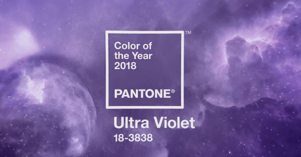
Purple is my favourite colour so I couldn't be happier about Pantone's latest announcement . Pantone says, "Inventive and imaginative, Ultra Violet lights the way to what is yet to come." Purple is an emotional colour and has always been considered a little tricky for marketing, tending toward the sentimental and feminine. I'm looking forward to finding ways to use it in my own marketing. How about you? Will you use more purple in 2018? Click to Tweet this Article
Using Pinterest to Create Brand Moodboards: Part II

Image
(guest post by Alison Knott) Nailing it down with a pin! Now that you’ve spent some time getting up close and personal with other brands in Part 1 , it’s time to find those patterns on Pinterest! You know 30 ways to look for ‘healthy snack recipes’ (who am I kidding, I’m married to Frito-Lay), so I know you’ll be set to start searching on Pinterest. But don’t stop at the obvious keywords like ‘bespoke logo’ or ‘life coach brand’. Branch out to of all kinds of brand application. Parrot Party: our new venture For this exercise, let's pretend you're starting an online store and forum called Parrot Party - a site for all the things parrot owners want and need. Most parrot-owner related websites are just breeders with old websites, and you want something that's going to appeal to parrot owners. Fresh, vibrant and speaks to owners ready to spend big bucks and share their knowledge on owning these birds. They choose to live with loud, colourful pets that live for 30+...

Design Colour Trends for Spring 2018

Image
excerpt from Pantone's NY Fashion Week Spring 2018 We're just getting back to serious work after summer vacations and the design world is already thinking about spring. I like what I see but then I'm a sucker for bright colours. You'll find these used online next year, too , not just in clothing stores. Pantone says: The Spring 2018 palette encourages a sense of fun and playful release. With an air of complexity and distinctiveness, we find ourselves in a sanctuary of color that is ideal for some more unique and dramatic color mixing. Click here to see all 12 colours in the Spring 2018 Collection on Pantone's website. Click to Tweet this Article

Crello is Not Just Another Pretty Graphics Tool

Image
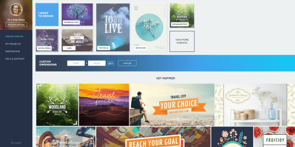
screenshot of Crello home page Just when I thought I didn't need another graphics tool, along came Crello ... yesterday. It's brand new (and I haven't been able to break it yet). If you're frustrated with trying to use Canva , this might be the solution for you. The interface is very much like Canva, yet Crello has veered away in the right places. I've always found the way Canva handles images as backgrounds and layers to be awkward; Crello takes a more simplistic approach. Crello has 6,000+ free templates and 10,000+ free design elements! I know that's going to be exciting to many besides me. Crello lacks some of my favourite Canva features, especially magic resize. But its ease of use and more intuitive interface is winning me over. I know I'll be exploring those 6000+ templates for many many more hours to come. For more info about Crello's functionality, read this press release . Or pop over to Crello.com and jump right in. Have fun, it...

Colour Palettes for Spring Marketing

Image
As I post this article, it's snowing heavily here in Nova Scotia. I'm very optimistic that spring will arrive... sometime. My husband and I are itching to get outside in the garden so, when I think of spring, I think of outdoors. Here are some colour schemes that make me think of spring. All photos are free from pexels.com . I saw this photo and immediately thought, "Fresh start!" Looks like a great place for a walk. The lime green is so bright and optimistic. The Easter Bunny outlined in buttercup yellow. All shades of green are reminiscent of spring. It wouldn't be spring without red tulips. Great contrast here. Spring travel to the tropics makes me think of soft pastel ocean scenes. Pass the wine. What does your spring marketing campaign look like? Click to Tweet this Article
Favourite Free Image Sources and Graphics Tools for Small Business Marketing

Image
Wondering where to find free images for your newsletter or blog? These are the most common sources we use for free images: FREE: http://pexels.com http://pixabay.com http://gratisography.com https://www.goodfreephotos.com http://www.freeimages.com https://morguefile.com http://unsplash.com FREE with Attribution: https://creativecommons.org Here are some graphics tools we use often: Create favicons for your website or blog  http://www.favicon-generator.org Create buttons easily  http://dabuttonfactory.com Convert graphics files from one version to another  https://cloudconvert.com Colour picker for Chrome  http://eye-dropper.kepi.cz Compress images  https://tinypng.com Of course, snapping your own photos is always a great choice! photo by Live to Create Photography / Flickr Click to Tweet this Article

11 Ways to Make Your Newsletter More Interactive

Image
An interactive newsletter will provoke responses from your readers. Aside from calls to action related to a sales process, interactivity is also good because it makes you more memorable . #1. Conduct a poll . Use an app (like SurveyMonkey) that allows you to show results after someone takes the poll. Keep it to one question . Publish the results in your next issue. #2. Include a special offer only for those who make it to the very bottom of your newsletter. Tell readers how to contact you to take advantage of the offer. #3. Link to a video . This can even be cleverly disguised as a screenshot of the video inserted into your newsletter. #4. Link to a free resource or some other type of giveaway. Upload the file to your website or Dropbox first, then use that link in your newsletter. #5. If your newsletter article is also on your blog, link to it and ask people to leave comments there. #6. Use click-to-tweet and other social media sharing options. Encourage readers to...

The Colours of Your Christmas Campaign

Image
If you are looking for new palette options for your Christmas marketing campaign, once again the image is the best place to start. Choose an image that is obviously holiday themed but in colours outside of the traditional red and green colour combinations. Pull the colours out of the image to create a palette that is exciting but non-traditional. Here are a few ideas that might spark something for you. You can pair almost any colour with gold or silver metallics to make it festive. So it stands to reason that the non-metallic versions of gold and grey would pair well. Together they create a feeling of warm elegance that is very inviting. Pair blue with silver and you get the same elegance with a cool tone. A little more formal or a little more relaxed depending what your text is. This palette can evoke cool breezes and festive nights or it can be used to trigger thoughts of grey, relaxed cottage days. It will be all in the word smithing. Purple and gold, pai...

Dates Add Context

Image
Using a date in your newsletter sends a signal to your reader about how often they can expect to hear from you. Not everyone will realize your newsletter is biweekly or monthly or quarterly, even if you've said it somewhere inside. Inside , near the top, the format of the date sends a message. Using month-year signals it's monthly but might also be used for less frequent, too. Using the specific date tends to signal a more frequent distribution. But not always because I also recommend this date format if you want to simulate the feel of a personal letter. Using season-year signals quarterly or less frequent. (e.g. Summer 2016) Your date could also be in your subject line , where it's purpose is to make life easy for your subscribers (or at least make sorting their email easier). Using month-year sends a clear message that it's a monthly newsletter as it sits in an inbox. Using a specific date in a more frequent mailing helps your subscribers easily t...

Colour Palettes for Fall Marketing

Image
An image might be worth a thousand words but it's actually worth more in colours, likely several hundred thousand. No doubt a photo will first catch your eye because of the overall composition, and the foremost colours play a role. Not only do each of us see colours differently , we feel about them differently, too. We think of autumn colours as vibrant reds, golds and oranges, or muted browns and greens. But they can also be cool shades, like frost on the morning grass or the pale blue sky. What does your fall marketing campaign look and feel like? Here are some traditional colour schemes, plus a couple of not so common themes to spice up your fall marketing. All of these images are free to use and can be found at pexels.com . These are the colours of October and Thanksgiving - bright, warm colours. For Halloween, add some purple for a sense of the mysterious. Muted shades, these colours feel outdoorsy and healthy. This scheme feels se...

Colour Palettes for Summer Marketing

Image
A photo can be a powerful marketing message , an expression of brand with more impact than a logo. It's worth a thousand words and expressed through many thousands of colours. We have feelings about the image itself and about the colours. You know how you feel when looking at a beautiful photo of sand, sun and surf? Aquamarine, white, pink, and deep blue. Even if you don't own a bathing suit, you want to be there. Summer colour schemes can be bright and vibrant, or cool and relaxed. What does your summer marketing campaign look and feel like? Here are some photos that inspired me. I've included html colour codes and links to the original photos on pixabay.com if you want to download for yourself. Can a fallen leaf be elegant? I think this one is - elegant and earthy. And, if I have time to contemplate this leaf, I must be feeling relaxed and at ease. Gazania are attention hogs in the garden with their warm colours and pinwheel designs. ...

8 Tips to Improve Readability

Image
Readability is defined as the ease with which a written text can be understood by a reader. ( The Free Dictionary ) While this definition certainly includes your words, sentences, grammar and writing style, it also has to do with the overall look of the text. Here are some tips to make your content look good, whether it's a newsletter, blog or website. #1. Use a slightly larger font size than you typically would when using Word, unless your content is lengthy. This ensures it will be easy to read on small screens and for those whose eyesight isn't perfect. Also consider using black or a dark colour as your font colour for the same reasons. #2. Avoid too much bold. Use bold sparingly to highlight the really important things, perhaps no more than once per paragraph. #3. Include whitespace around text and images, and between sections. Pictures look better and text is easier to read. #4. Use bulleted or numbered lists to simplify complex information. This provides ...

Online Presentation Skills of Utmost Importance

Image
A recent iContact webinar listed "lack of presentation skills" among the top content marketing challenges . The others are no time, fear, and lack of imagination. The term "presentation skills" makes me think of PowerPoint, not online marketing. It's certainly an apt description but what does it mean specifically? Technical skills related to using software applications Technical skills related to graphic design Creativity and an eye for design Hyper-attention to detail If you don't excel at these things, you should be delegating them to someone who does... and spend your time doing what you do best. An expert will help you overcome those other challenges , too! photo by alexander.lissa / Flickr Click to Tweet this Article

Pantone Colour of the Year for 2016

Image
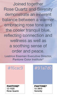
Colour has a big impact on all of the work I do so I'm always eager to see the colour trends published by Pantone. The seasonal colour schemes are based on trends in clothing design. I'm not sure what the 2016 Colour of the Year is based on but there's two of them. I wonder if someone high up at Pantone just had a baby. While I quite like the colours personally, I don't see much business application. If a new client with a baby shop comes along, I might think differently, of course. image source Pantone.com Click to Tweet this Article