Using Pinterest to Create Brand Moodboards: Part II
(guest post by Alison Knott)
Nailing it down with a pin!Now that you’ve spent some time getting up close and personal with other brands in Part 1, it’s time to find those patterns on Pinterest!
You know 30 ways to look for ‘healthy snack recipes’ (who am I kidding, I’m married to Frito-Lay), so I know you’ll be set to start searching on Pinterest. But don’t stop at the obvious keywords like ‘bespoke logo’ or ‘life coach brand’. Branch out to of all kinds of brand application.
Parrot Party: our new venture
For this exercise, let's pretend you're starting an online store and forum called Parrot Party - a site for all the things parrot owners want and need. Most parrot-owner related websites are just breeders with old websites, and you want something that's going to appeal to parrot owners. Fresh, vibrant and speaks to owners ready to spend big bucks and share their knowledge on owning these birds. They choose to live with loud, colourful pets that live for 30+ years, and you want to connect with that market. Where do you start on Pinterest, then? Well here are some ideas guaranteed to get you started.
Colour Palettes: because there’s literally 500 shades of light blue out there
What common colour combinations did you see in your research? Maybe it’s a good thing that they’re all the same and you want to do different. That will set you apart. On the other hand, it’s possible you will lose credibility for certain industries, so be sure to weigh the pros and cons. Additionally, a colour palette may contain a surprise tint you didn’t consider!
 |
| tropical colour palette |
In the case of Parrot Party, we started with searching "tropical colour palette" but didn’t like how they leaned more toward beach scenes. What we were attracted to are these, inspired by flowers. Also, it turns out some of these swatches are similar colours to the plumage of various parrots - bonus!
Typography: we’ve all got opinions on fonts, who are we kidding?
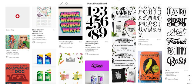
Jokes about Comic Sans aside, different fonts evoke different sentiments. What fonts will best represent your business when you’re not around? Is it always script-like? Very stern blocks? A lot of detail or very straightforward typography? Bonus points if what you pin includes the font name. But if you’re not sure, there’s a great website called WhatTheFont? that can help you identify the typeface just by uploading an image.
 |
| bold fun fonts |
For Parrot Party, you didn't like all the super whimsical, so you search "bold fun fonts", thinking about all those funny parrot videos online. Bingo - lots of character in these picks.
Patterns, shapes and graphic representation of your keywords
A designer can do a LOT with a great pattern. They’re an excellent way to create graphics when you don’t have any photography available. I recall a branding session with a client in which we spent 20 minutes just looking around us for what sort of patterns she liked. My idea of ‘geometrics’ was way different than hers. Are we talking tiny, intricate repeats? Bold circles of two colours? Again, pin with purpose.
Additionally, you can be literal with a word that's in your branding, and then search to see how other designers and illustrators have designed that item.
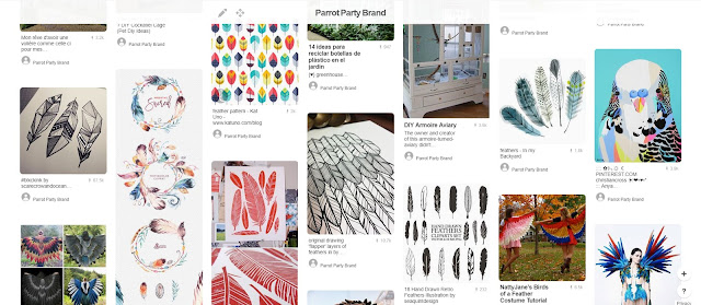
You don't have a clear idea of the Parrot Party logo yet, but you do know that you want to represent all parrots. Using "feathers" in some capacity would keep the brand inclusive. That turned into another search for "feather illustration" to see how other people render feathers. There were lots of watercolour options but they're too soft for your audience. Instead, you're drawn to these more bolder, graphic renderings.
Storefronts, office design and other interiors
Even if you work exclusively in digital/online, who’s to say you can’t dream. What would the physical location of your company look like if it did exist? A brand is more than a logo – it’s a whole experience.
 |
| Aviaries and flight cages |
So what if Parrot Party had an office space? "Aviaries and flight cages" are every parrot owner’s dream – a large space for their pets to fly around. Then you think about other online giants like Google and their wide open spaces... there’s something to pin there, too. Now you've seen some design pattern themes of natural wood, green plants, black or metal wire. There may be merit in drawing upon those textures later on.
Stationery, such as business cards, envelopes, letterheads
This isn’t to dictate to your designer how to design your calling card, but rather to get your head wrapped around execution possibilities. Explore words like foil, spot varnish, handmade and so on for more unique applications.
Your initial search of "feather stationery" didn't really reveal the level of bold you're looking for, but there were some neat ideas around cutouts and geometric shapes to render birds that you might consider for your business card.
And there you have it.
A whole bevy of imagery that you curated and approve of to start designing with. They say an image is worth a thousand words, and you, dear reader, just collected about four billion.
Click to Tweet this Article
Alison Knott is the owner of Eraserheader Design, a one-stop web consultant and brand shop. She’s been turning client napkin scribbles into purposeful business brands since 2007. You can find more great branding and online business tips from her weekly Facebook Live show LunchPress.




Comments
Post a Comment