What Colour is That?
I get into some interesting discussions with clients and friends about colours. The fact is that we can do a lot to make sure the colours in our branding are consistent wherever used online. And we can do the same for our print materials.
Consistency is the key because none of us see colours quite the same as anyone else.
First there's the way they appear to us because of the way our eyes work. "Colour (color) blindness (colour vision deficiency, or CVD) affects approximately 1 in 12 men (8%) and 1 in 200 women in the world." (source: colourblindawareness.org). About 4.5% of the population is affected by some form of colour blindness, most of them men. And it's not all black and white and grey - there are different types of colour blindness.
Then there's our perceptions about certain colours, and even shades of those colours. For example, baby pink and soft mauve aren't typically associated with business, unless you own a baby boutique. Red is associated with power, and green with nature. And have you ever had a discussion about whether something is taupe or grey? How about purple or burgundy or fuschia?
To confuse things even more when it comes to colours online, computer monitors and tablets all display colours differently. A friend once asked why I used pale pink as the background for a website - it was actually pale yellow. I know this because I calibrated my monitor. Regardless, of how exact I can be on my own screen, it's going to look different (and perhaps feel different) to everyone else. Look at your website on a different computer, or several different computers, and you'll see what I mean. (And did you know that some colours are different when saved as a .png versus a .jpg file?)
So what do you do? Be consistent. You might not have a lot of control about how other people see your branding colours, but you can make sure they look the same everywhere online.
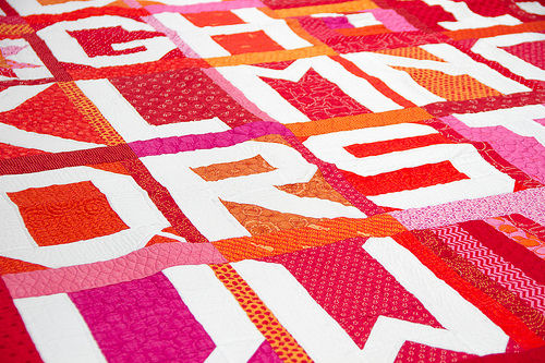
photo by Incase / Flickr
Click to Tweet this Article


Comments
Post a Comment