I Love Uphill Graphs!
I've been known to fixate on graphs and measurements. See, I really hate working for no reason. I like to know that my efforts make a difference. If not, I either tweak and retry, or I give it up and put my efforts elsewhere.
You can imagine that I've been keeping an eagle eye on all this online stuff - blogging, social media - since I took those first tentative steps. And it's really cool that the stats get dished up for me!
I was delighted when I saw this graph of our blog statistics:
We did something right... but what was it? How do I replicate it?
I think this happened because 3 or 4 times a week I started posting links to older blog posts on Twitter and LinkedIn. But, well, doesn't that seem just a little too easy?
I'm wondering if perhaps the holidays mean people were reading more. I'd love to hear from anyone that's seeing a change in their blog stats for December.
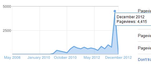
You can imagine that I've been keeping an eagle eye on all this online stuff - blogging, social media - since I took those first tentative steps. And it's really cool that the stats get dished up for me!
I was delighted when I saw this graph of our blog statistics:
Before December, the highest number of page views we'd ever had in one month was in October - 997 views. I was kind of happy when that happened. In December, our page views more than quadrupled!We did something right... but what was it? How do I replicate it?
I think this happened because 3 or 4 times a week I started posting links to older blog posts on Twitter and LinkedIn. But, well, doesn't that seem just a little too easy?
I'm wondering if perhaps the holidays mean people were reading more. I'd love to hear from anyone that's seeing a change in their blog stats for December.


Comments
Post a Comment